The new identity of Paginemediche and more about EMDR therapy
S02-E02 (22 January 2023)
If you were forwarded this email or if you come from Linkedin, you can sign up to receive an article like this every fortnight.
Ciao,
first of all, thank you! If you are reading this, you haven’t marked my emails as spam yet 😜. I thought a lot about the periodicity of this newsletter and, in the end, I decided to create a new episode every two weeks for the next six months. It will be divided into three sections: reflections and lessons learned about my work (strategy, product leadership, technology), personal reflections and experiences, and readings I found interesting.
The rebranding of Paginemediche
Last year, I helped Graziella Bilotta, the CEO of Paginemediche (an Italian digital health company), design a new business strategy and reorganize the portfolio of products. To reflect the new direction, the company also decided to refresh its brand identity.
Paginemediche (in English Medicalpages) is not an easy brand to manage. It is a descriptive name like Whole Foods or The Body Shop, and as such, it tends to cage the company’s value proposition. At the same time, it's a name that - at least in Italy - brings to mind the telephone directories (once called Pagine Bianche) or a hard copy magazine you’d expect to find in a doctor’s office waiting room.
Has the company thought about changing the name? More than once. We also ran an internal contest to find a new one, but we got stuck in front of three factors:
Paginemediche is a name that has good brand equity among healthcare professionals in Italy;
the domain was registered in 2000, and its age contributes to the organic positioning on search engines;
last but not least, the team had an emotional attachment to it.
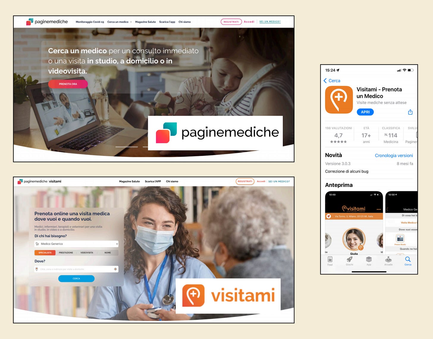
Changing the whole corporate identity would have been a step too far, so the CEO decided to put aside any discussions about the name and hired an agency to work only on a restyling of the logo. This activity had to be done anyway because, in 2019, Paginemediche acquired another company, Visitami, and the two identities coexisted in a very messy way.
Renewing the positioning
Even just changing the logo of a company or product implies thinking about its positioning. We went through several iterations with the team and discussed different options, but ultimately we decided to put the patient at the heart of the rebranding activity.
The previous vision was much more generic: we are the largest Italian digital medicine platform that connects doctors and patients. As such, it left much more room for interpretation of what the company could do. In fact:
patients and doctors are on the same level,
the phrase explains what the company does but not why.
Adopting a vision that offers room for interpretation and opens the door to many possibilities works very well for a service or consulting company because consultants tailor their offerings to clients’ demands. But Paginemediche wanted to position itself as a product company. This strategic decision required narrowing its focus and finding a description that was immediately understandable for a specific target of customers.
Consumer goods companies are a good example of my approach because each product is designed to occupy and dominate a niche. Think of toothpaste: there are those for breath, those that whiten teeth, those for gum care, and on and on. But how many toothpastes can you think of that have multi-faceted positioning and offer all the benefits at once?
With software-based products, the same principle applies. You need to find a positioning that is effective and that makes the product immediately understandable to your potential customer. And so choices need to be made; that is, options need to be eliminated. Sometimes this is not easy, especially if we are talking about a company that has a legacy.
The new vision statement of Paginemediche sounds like that:
Paginemediche helps people achieve their health goals and take care of the health of their loved ones to live life to the fullest.
Putting the patient at the center also means correctly framing the services Paginemediche offers to doctors. The same vision can be applied effectively to healthcare professionals. For example:
Healthcare professionals use Paginemediche's digital health and practice management services to help people achieve their health goals and take care of the health of their loved ones.
In line with the vision, the company chose three values to guide the building of the brand:
authority: «our products and contents are based on scientific evidence and are created in collaboration with health professionals»;
empathy: «we put ourselves in the shoes of our users, customers, and colleagues and try to see the world as they see it»;
simplicity: «our products are easy to use and do not require manuals. They make health professionals’ routines easier and patient care more accessible».
The new logo
Once we had created a consensus around the vision, we moved to evaluate logo proposals. When you touch a logo, you enter the realm of personal tastes and have to deal with objections: why are we using a smile as a logo? Isn’t that a bit too trivial? Do you really want to use pink as the main color? Pink, seriously? All colors, but not pink, please. 😂
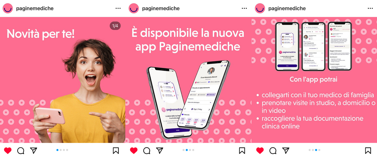
This is the result of the project. A very pop iconographic element that aims to summarize Paginemediche’s approach: first and foremost, human, simple, and professional.
A brand identity is much more than a logo or a color. It is a dynamic process, and it evolves over time: a story that you have to write day by day with coherence. When you say that your values are empathy, simplicity, and authority, you have to design the software accordingly. You have to build a culture around these values and make sure that everything you do is coherent. I will probably write something about aligning brand identity and company culture: it’s a topic of huge importance to every business.
E Pluribus Unum…
The rebranding of Paginemediche was not easy because it required managing expectations and building consensus on a new vision. I really like the result, and I am convinced that the quality of the work will help the company stand out from the competition and open up new business opportunities for the company.
When we started the process of defining a new strategy, Paginemediche was still the sum of two entities that hadn’t been amalgamated yet: an online magazine with millions of readers every year (Paginemediche) and a booking SaaS for general practitioners and specialist doctors (Visitami). There were two identities and two stories that were waiting to converge. After the rebranding and months of work, the team completed the unification of the two services under a unique identity and launched a new, awesome mobile app (you will know more about it in the next episodes).
The rebranding project was entrusted to the Florentine agency Forte, founded by Francesco Terzini, Giulio Muratori, and Filippo Corretti, who have done an amazing job. Thanks, guys… we will surely have a chance to work together again!
How EMDR therapy works in practice
After last week's episode, many people asked me how EMDR therapy works in practice. I found this video with a step-by-step walkthrough of a session:
This is more or less what I did with my therapist, and reliving some emotions was not easy at all. I have learned over the years that the success of a therapy depends, above all, on the willingness to get involved and to confront oneself, as well as on the technique used by the therapist.
You can go to the psychologist every week and chat amiably about more or less while remaining on the surface of things, or you can decide to go deep, looking with confidence at the outcome you will get. There is nothing immutable when it comes to emotions.
Interesting readings
Why love matters: How affection shapes baby’s brain by Sue Gerhardt is a must-read for anyone who cares about the well-being of children. The book delves into the science behind how a baby's brain develops and how crucial affection and attachment are to that development. Gerhardt presents the information in an easy-to-understand manner, making it accessible to a wide audience. The research and studies cited in the book are thorough and provide a strong foundation for the author's arguments.
Tony Fadell led the teams that created the iPod, iPhone, and Nest Learning Thermostat and learned enough in 30+ years in Silicon Valley about leadership, design, startups, Apple, Google, decision-making, mentorship, devastating failure, and unbelievable success to fill an encyclopedia. In his book Build: An Unorthodox Guide to Making Things Worth Making, Fadell provides tons of valuable insights and advice. It is worth reading especially if you are at the beginning of your career.
***
Hey, it looks like you made it to the end of the episode again this time. Thanks for taking your time, I hope I've been helpful. If you think my sketchbook might be of interest to someone else, I'm glad if you share it on social media and forward it to your friends and colleagues that might be interested.
See you in a couple of weeks 😊
Nicola


